Harnessing Colour Psychology A Palette of Brand Power
What if Cadbury were a yellow brand? Or if Facebook had a green wash all over it?
Their growth, their perceived impressions would not be the same. The way we know and revere the brands today would not be the same. It is not a coincidence, but a well-thought out strategy.
What is the first aspect of a brand that attracts you to it?
The visuals! First impressions decide the success of a brand. Hence, every tool must be wielded with finesse to captivate and engage your target audience.
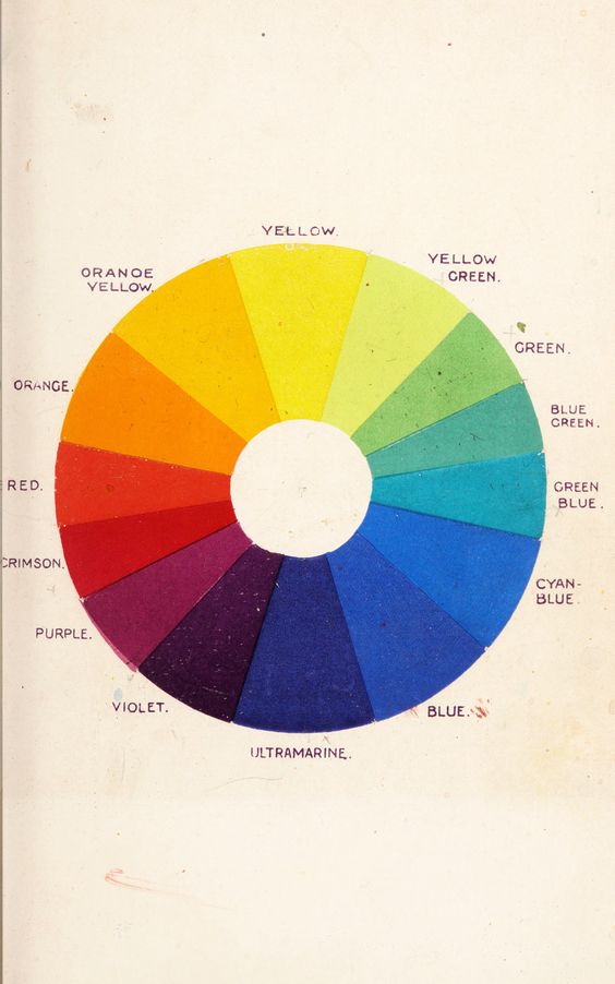
Amidst the vast arsenal of branding techniques lies a hidden gem—colour psychology.
Colours possess an uncanny ability to weave emotions, shape perceptions, and influence consumer behaviour. Research says, up to 85% of purchase decisions are influenced by the power of colour.
How Does Colour Work Its Magic on Brands?
Igniting Emotions:
Colours deeply stir human emotions.
Warm hues like red, orange, and yellow can ignite feelings of energy, passion, and optimism. Cool tones such as blue, green, and purple evoke a sense of serenity, trust, and harmony.
By choosing colours that align with the desired emotional response, your brand can forge a solid connection with your audience.
Influencing Decisions:
In a matter of seconds, potential customers form judgments about products or brands, with a significant portion of that assessment based solely on colour.
By strategically selecting the right hues, your brand can enhance perceived value, create an immediate emotional bond, and influence the decision to purchase.
Crafting Perceptions:
Colours shape the lens through which consumers perceive your brand.
Each hue signifies values and associations.
If you are a technology brand, or a banking company you would want to display trust and innovation – so you choose blue. If you are a creative house bold and passionate are the qualities you would want to share, without having to talk about them – so you choose red or purple!
By understanding colour associations and cultural nuances, your brand can effortlessly communicate its intended message.
Why Should You Embrace the Magic of Colour Psychology?
Unforgettable Recall:
When customers consistently associate your brand with a specific colour palette, it becomes a visual cue that sparks instant recognition and deepens brand loyalty.
Think of iconic brands like Starbucks, Pepsi, and McDonald’s, who have etched their hues into the collective memory.
Harmonious Branding:
You can harmonize all your branding and marketing tools, whether on local or international scales.
With a cohesive colour palette across websites, packaging, and marketing materials, your brand creates a seamless and unforgettable experience.
Consistency breeds connection and strengthens brand identity, forging an unbreakable bond with your audience.
A Portal to Brand Experience:
With a mere glance, colours can weave a story of what your brand stands for.
Forest Essentials employs earthly and nature-inspired tones of brown, setting the stage for an immersive and authentic experience.
Prada embraces the mystique of black, evoking luxury and exquisite style.
Colours lay the foundation for your brand experience, leaving no doubt as to what customers can expect.
The Strategic Use of Colours in Company Branding:
Red: Signifies: Boldness, passion, energy, and adventure. Best suited for: FMCG brands and creative powerhouses.
Examples: Coca-Cola, H&M, Netflix.
Green: Signifies: Nature, growth, prosperity, health, and calmness. Best suited for: Health-centric brands, organic products, and business services.
Examples: Spotify, Whole Foods, Tropicana.
Blue: Signifies: Trust, loyalty, logic, innovation, and calmness Best suited for: Technology, insurance, and finance companies.
Examples: Meta, Bajaj Allianz, HDFC, KPMG.
Purple: Signifies: Luxury, creativity, and royalty. Best suited for: Tech brands, media houses, and luxury brands.
Examples: Cadbury, Yahoo, Hallmark.
Black: Signifies: Power, sophistication, elegance, integrity, and style. Best suited for: Fashion brands and network companies.
Examples: Prada, Sony, Adidas.
How to choose your Brand colour:
Selecting the perfect colours for your brand requires planning, not a whim. You can use these points as principles to think over it:
Appeal to Your Audience:
Align your brand colour with the expectations and preferences of your target audience. Create a symphony that resonates with their emotions and aspirations, striking a harmonious chord.
Stand Out from the Crowd:
Choose hues that set your brand apart, making it an unmistakable beacon amidst the bustling marketplace. Paint your brand in shades that leave an indelible mark on the canvas of consumer consciousness.
Express Your Core Values:
Allow your colours to represent your brand’s essence. Let them reflect the very core of your values, becoming a visual testament to the ideals you hold dear.
Last thoughts
The power of colour psychology aids your brand with a new dimension. By employing an effective palette with skill and strategy, brands can evoke emotions, shape perceptions, and create deep connections with their audience.
There is limitless potential of your brand’s visual identity. Don’t choose elements on a favouritism, personal preference or a whim. It is the face of your brand you’re deciding.
Give it an extra thought. Make sure it is everything your audience would like to associate with.
For assistance in finding your brand’s colours, get in touch with us!